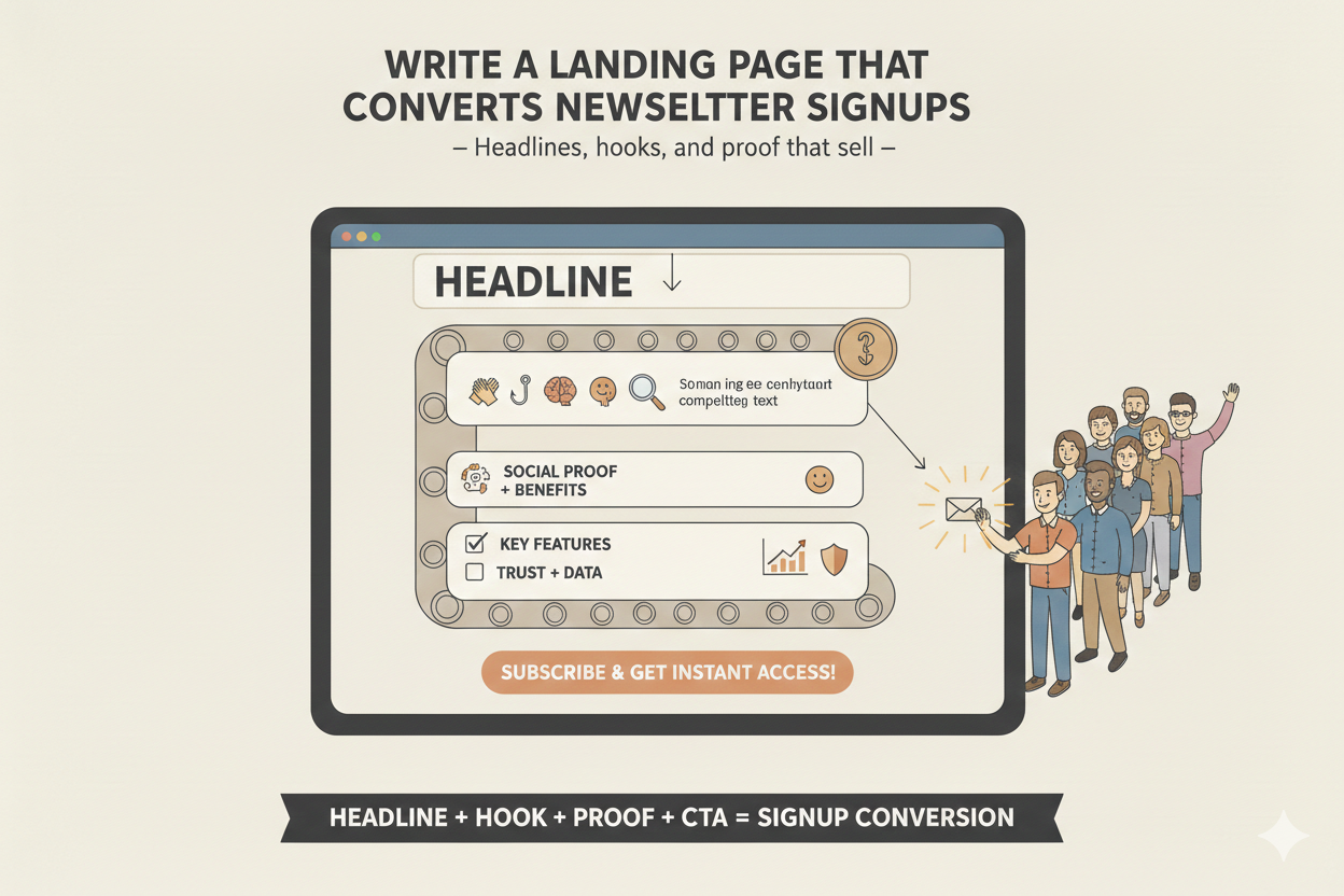
Write a Landing Page That Converts Newsletter Signups
Most newsletters fail before they even reach the inbox. You can write brilliant content, craft perfect subject lines, and design compelling emails but if your landing page can't convert visitors into subscribers, your list won't grow.
A landing page isn't decoration. It's the first handshake with your audience, your first chance to earn trust and demonstrate value. Done right, it turns casual visitors into loyal readers, advocates, and eventually, your most engaged community. Done wrong, it's a dead end.
Here's how to write a landing page that actually converts, using headlines, hooks, and proof that sell without gimmicks, hype, or overpromising.
Step 1: Lead with a headline that stops scrolling
Your headline is the first thing visitors see. It must:
- Speak directly to your ideal audience
- Highlight a tangible benefit or transformation
- Be clear and specific, not clever for cleverness' sake
Examples:
- "Learn the Email Strategies That Grow Startups Without Ads"
- "Get Curated Insights That Actually Make Your Inbox Worthwhile"
- "Turn 10 Minutes a Week Into a Newsletter That Drives Deals"
If your headline doesn't clearly tell visitors why they should care, they won't scroll. They won't read. And they definitely won't subscribe.
Step 2: Hook them immediately with your promise
After the headline, your subheadline or opening line is your hook. This is your chance to build curiosity and communicate value instantly.
Good hooks answer the visitor's silent question: "What's in it for me?"
- Focus on outcomes, not features.
- Use clear, concise language.
- Show that you understand their problem.
Example: "Most newsletters waste your time. This one gives you ideas, insights, and examples you can act on immediately so you spend less time guessing and more time growing."
Hooks should make people pause, nod, and want to sign up before they even read the first paragraph.
Conversion lift by landing page element
Lift = avg increase in CVR when element is added vs removed.
Headline clarity is the single highest-leverage optimization. If readers don't understand the value in 3 seconds, they leave.
Traffic source conversion rates
Where you send traffic matters as much as the page itself.
Step 3: Show proof you're worth subscribing to
Trust isn't built with claims, it's built with evidence. Proof can take many forms:
- Social proof: "Join 5,000 founders and creators getting actionable strategies every week."
- Testimonials: Short quotes from readers who benefited from your newsletter.
- Metrics: Subscriber numbers, open rates, or case studies.
- Media mentions: "Featured in TechCrunch, Forbes, and LinkedIn News."
People hesitate to give their email. Proof shows them you deliver on your promise. This ties directly into the metrics that actually matter for newsletter growth.
Step 4: Keep copy concise and scannable
Visitors skim. Long paragraphs kill conversions. Your landing page copy should be:
- Broken into short, digestible sections
- Bullet points for benefits or outcomes
- Bold headers to guide reading
- Minimal fluff; every word counts
Example structure:
- Headline – Clear benefit
- Subheadline – Hook
- 3–5 bullets – What readers get
- Proof/testimonials
- Call-to-action (CTA)
Five elements. One page. Maximum signups.
Not 'Join my newsletter.' Use 'The weekly email for B2B founders who want to 2× their pipeline without hiring.' Specificity converts.
What will they learn? How often? What makes you different? Answer all three in 15 words or less each.
Five reader logos, a pull quote, or a subscriber count. If you're early, use 'Join 200 founders who read every issue.'
Show a real past issue or a screenshot. Readers convert faster when they can see exactly what they're signing up for.
Step 5: Craft a call-to-action that converts
Your CTA is where conversions happen. A great CTA is:
- Specific: Avoid "Subscribe" alone; use outcome-driven language like "Get Weekly Insights" or "Join 10,000+ Founders."
- Visible: Place it above the fold and repeat it at the bottom.
- Low friction: Ask only for an email address, not a full profile.
Example: "Get weekly strategies that grow your newsletter free, actionable, and direct to your inbox."
Understanding how to build an audience that actually wants you will help you craft CTAs that resonate with the right people.
Step 6: Design for clarity, not flash
Landing page design should guide attention, not distract. Keep these principles in mind:
- Use whitespace to make elements stand out
- Keep forms short and prominent
- Avoid cluttered menus or links that pull visitors away
- Use visuals to reinforce benefits, not just decoration
Remember: clarity sells. Confusion kills conversions.
Step 7: Test and optimize
Even the best landing page can improve. Test:
- Headlines and subheadlines
- CTA text and placement
- Copy length and bullet points
- Visual elements like images or screenshots
Use metrics like conversion rate, bounce rate, and scroll depth to iterate. Optimization is a continuous process, not a one-time task. As we discuss in the 3 critical newsletter metrics, focusing on the right signals drives sustainable growth.
Putting it all together
A high-converting newsletter landing page:
- Grabs attention with a clear, benefit-driven headline
- Hooks readers with a compelling subheadline
- Builds trust with proof, testimonials, or social validation
- Makes reading easy with scannable, concise copy
- Converts with a strong, visible CTA
- Supports clarity with clean, purposeful design
- Improves continuously through testing and iteration
When done right, your landing page becomes a self-sustaining growth engine, turning every visitor into a potential subscriber and advocate. This is part of turning your newsletter into a revenue engine.
Final thoughts
Your newsletter isn't just a list, it's your most direct line to your audience. Your landing page is the gateway. Treat it as such.
At Inbox Alchemy, we help founders craft landing pages that don't just look good, they convert. Headlines, hooks, proof, and clarity are combined deliberately to attract the right readers, earn trust, and grow your audience consistently. Every element is designed to turn curiosity into commitment.
Whether you're working on your first 1,000 subscribers or scaling to newsletters that compound forever, the landing page is where growth begins.
Frequently Asked Questions
How long should my landing page copy be? Enough to convey value, proof, and a CTA, no more. Brevity beats verbosity, but don't sacrifice clarity.
Should I use multiple CTAs? Repeat a single, clear CTA above the fold and at the bottom. Don't confuse visitors with too many options.
What counts as proof if I'm just starting? Share early testimonials, personal experience, or insight into your expertise. Even small wins matter. Learn more about building trust with cold audiences.
Do I need images or visuals? Only if they support your message. Screenshots, examples, or context visuals work; stock images usually don't.
How do I know my landing page is effective? Track conversion rate primarily. Secondary metrics include bounce rate, scroll depth, and signup source attribution. Understanding engagement measurement helps you interpret these signals correctly.
Framework Summary
- Step 1 — Scroll-stopping headline: Speak directly to your ideal reader with a clear benefit or transformation; clever without clarity kills conversions.
- Step 2 — Immediate hook: Your subheadline or first line answers "what's in it for me?" — focus on outcomes, not features.
- Step 3 — Social proof: Subscriber counts, testimonials, metrics, and media mentions overcome the friction of giving an email address.
- Step 4 — Scannable copy: Short sections, bullet points, bold headers, and no fluff — visitors skim and decide in seconds.
- Step 5 — Outcome-driven CTA: Replace generic "Subscribe" with specific language like "Get Weekly Insights" or "Join 10,000+ Founders"; place above the fold and repeat at the bottom.
- Step 6 — Clarity-first design: Whitespace, short forms, and no competing links keep attention on the single conversion action.
Written by

Investor • Founder • Creator
Ryan Estes is co-founder of Kitcaster, an eight-figure bootstrapped podcast booking agency acquired by Moburst in 2025. He created AI for Founders, a podcast, newsletter, and workshop platform reaching 47,000+ entrepreneurs and CEOs. Based in Denver, Colorado.